Anti Marketing: Aesop
Aesop aim to embody a premium brand focusing on revealing the value of their products rather than selling value. This revelation is through their branding and meticulous alignment in all they do.
Contrary to people’s beliefs, Aesop has been around for a lot longer than often given credit for. The brand was founded in Australia in 1987 by Dennis Paphitis, a hairdresser, with a well sought out hair salon in Melbourne. He was always inspired by the idea of creating a calm refuge for his clients, which is clearly something the brand took with them. The name Aesop comes from Greek roots, which is a popular place to go looking for brand name inspiration (Amazon, Nike, Pandora… the list goes on), which was the name of a Greek storyteller and former slave credited with a number of fables now collectively known as Aesop's Fables. It is, however, unknown whether Aesop the storyteller was a historical or fictional figure.
Often described as a success of "unbranding", Aesop's forte is elevating something as utilitarian as skin care products to a form of art. While confronted with an endless list of competitors, Aesop chose the classic back to basics approach and rooted itself in an intellectual context. Its "utilitarian luxury" perspective, a sort of Hermès meets Muji take, strongly contrasts with other brands investing in flashy marketing strategies and imageries, and its frame of reference is far from a traditional cosmetic one. It focuses on the search for knowledge. Just like in a bookshop, clients enter a filtered atmosphere and browse through the shelves in search of information. A sort of scholar treasure hunt in a library-like environment.
The beauty industry is a multi-billion dollar powerhouse, often driven by dynamic trends and elaborate, if not over the top, activations and marketing campaigns. But while many brands and retailers have gravitated towards this strategy to boost their visibility, Aesop proves that there are other paths to building a successful brand - one that isn't reliant on endorsements and algorithms, a path that matter.
Aesop refuses to tick most of the boxes of the beauty industry. There are no glossy packs, counters, or ads. There are no promises of 'agelessness' or eternal beauty. No usage of celebrity or supermodels across the online and offline marketing collaterals. No pumped-up mission to change the world, either. Aesop shuns what they consider gimmicky category talk. Instead you will hear surprisingly matter-of-fact statements that declare that high-grade, human-invented ingredients like magnesium ascorbyl phosphate are chosen simply because they are the most effective for a specific purpose.


Aesop aim to embody a premium luxury brand focusing on revealing the value of their products rather than selling value. This revelation is through their branding and meticulous alignment of all touch points, in all they do. On their websites or in their highly-designed stores, the look of Aesop is a studied mix of black, white, and warm golden brown. Just like their colour palette, the logo has stayed the same since the launch in 1987.
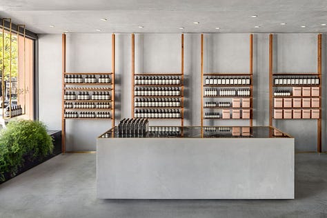
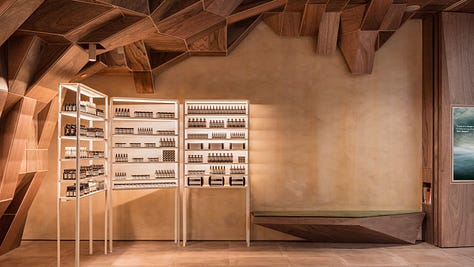
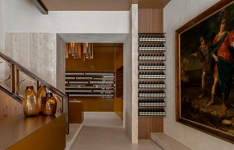
Although the brand preserves a general aesthetic, every single Aesop store is designed and decorated in a different manner. If you are attracted by the artistic display of an Aesop store, their iconic moisturiser dispenser outside the window invites you to make the product discovery. Once you step inside, the discovery continues. Even if you have been in another Aesop store before, you might not be able to resist the desire to enter the other ones for each store represents a different interpretation of the strict brand identity. Aesop distances itself from the globally identical beauty counter of many competitors.
Aesop opened their first store in Melbourne's suburb St. Kilda in 2004. Since then, retail presence has been a pivotal part in the brand's identity and strategy. Aesop work collaboratively with interior designers to craft distinct spaces where their products take centre stage. Despite each store's innate differences, there is a vein of similarity that runs through them all in essence, embodying the Aesop design philosophy: apart from a line of creams that look like paint tubes, every bottle is brown, with a black cap, and a beige label covered in small writing - Aesop's packaging started as a simple utilitarian vision: a modern apothecary packaging without the fuss, yet with the information one needed.


In an interview with Co.Design, creative director Marsha Meredith outlined the vision for their retail stores: “The core thing that we try to do is create a little respite from the clutter of everyday life,” Marsha said. “The shops offer a moment of sanctuary and calm — you can appreciate the sense that good design offers.” Marsha opened up about the Aesop principles for their retail design process many times, and they’re fairly simple in essence:
Respect the designers — Meaning let the designers take control with the direction you give them. You’ve hired them for a reason, and trusting in their process is the best way to ensure success of the end result .The uniqueness is so imperative within the Aesop retail designs.
Embrace the local character — Part of the core reason for the difference in each store. Aesop works to fit in with their surroundings and take inspiration from their location — rather than forcing the space into a standardised format.
Design for change — The brand itself is evolving, and they want their stores to evolve with them. This includes materials that patina and adapt with age, or simply in the fluidity of the store in use.
Reject sameness, but edit — Something that the brand has done since the beginning “Such a great thought from the beginning was to reject sameness… From the first store in St. Kilda, even though we didn’t have a rule book, we instinctively rejected sameness.” said Marsha.
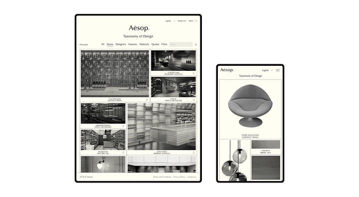
Since the brand views itself as a general opening to knowledge, their website offers sections such as Aesop on Design or Aesop in Film, in which their clients discover the making of the architecture of the Aesop stores, or are invited to sit down with a drink to enjoy a selection of short films, made by Aesop of course. The brand even publishes a literary magazine, The Fabulist, in which no Aesop products are mentioned. And of course, since their interest for design and architecture is obvious: the brand has its very own design website, Taxonomy of Design, which offers exceptionally good interior design information and highlights Aesop’s search for simple perfection. “Well considered design improves our lives”, the Aesop website tells us.


The way Aesop founder Dennis Pahitis went about bringing the brand to life created the icon Aesop is today. There is Dennis choosing every quote that appears on labels, walls, brochures. There are the decisions to clear entire stores of all products to make space for books of authors he admires (Gabriel Garcia Marquez) or designers (Jo Meesters) ceramic artists (Ray Chan). And then there are favourite neighbourhood shops-, restaurants- or theatre tips on the web site and printed on Aesop brochures, paper bags. When asked to comment on these unusual choices, Dennis Paphitis tells journalist he prefers to answer in writing as “it will provide a more considered and precise answer”. He wants Aesop to be known for its spirit and attitude, for being a “celebration of the everyday” where less is better, where substance wins, where things have a deeper meaning.
How could the anti-beauty beauty brand survive such ownership and expansion spiritually? Just like the customers and the market, a future owner has to be ready to receive and appreciate this brand. Earlier this year, L'Oreal had agreed to buy Aesop from its previous parent company Natura in a deal worth $2.53 billion. Under Natura's ownership, Aesop became the conglomerate's highest revenue earner over the decade between 2012 and 2022, increasing gross sales from $28 million to $537 million during the ten-year period.


